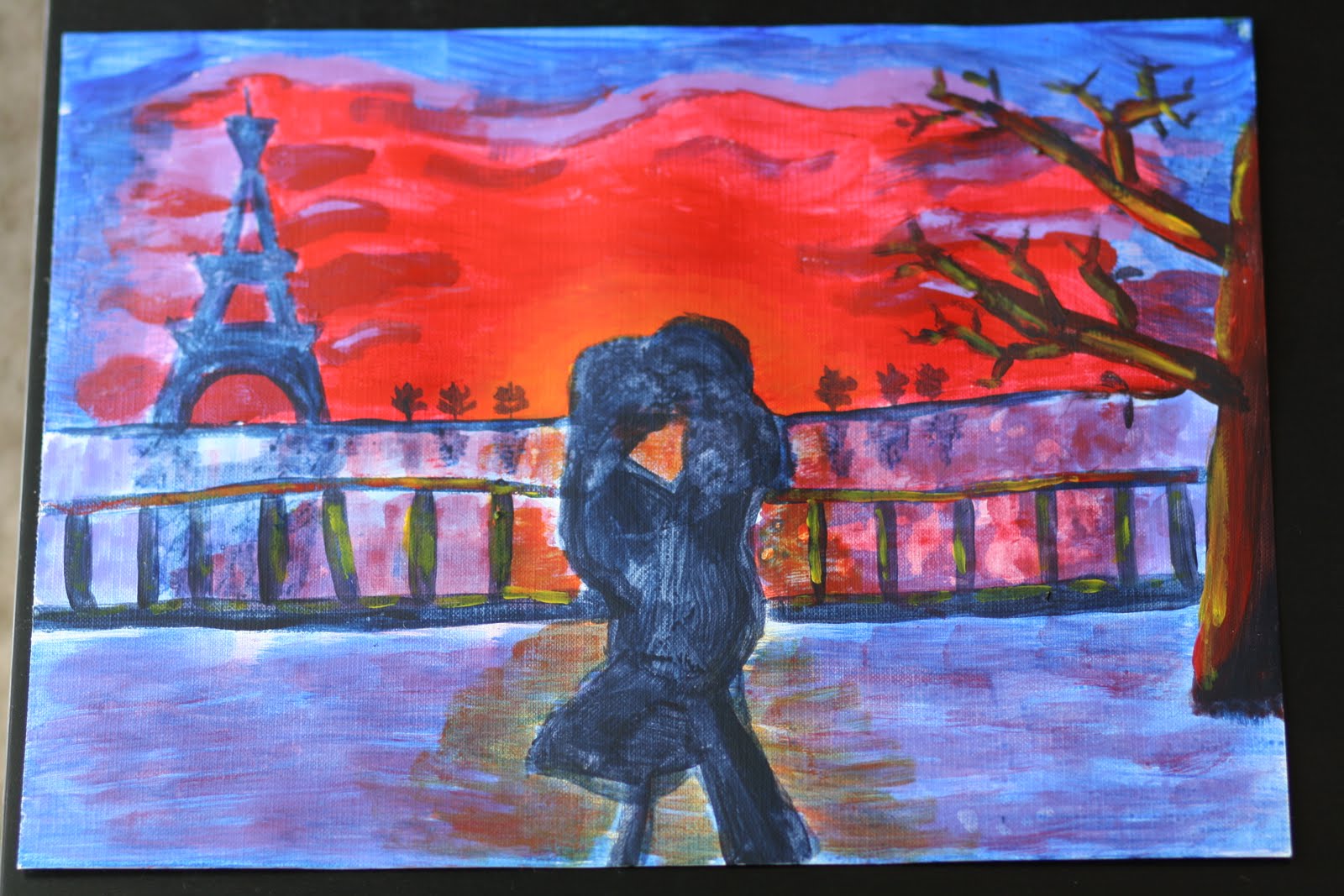
OK, I get it! I am not a landscape artist...yet! I just thought that every artist should be good at painting landscapes and real life, but I don't even really like to paint like that. I would love to sit in front of a building and make it look like a photograph on my canvas, but I'm not there yet. I like tattoo art, and I'm good at painting flash and why not just stick to what you're good at, right!? So, for all of you that missed my most talented flash pieces, they are back in full motion!

For this project, I decided I was going to do 3 different attempts at the same piece of art: acrylic, liquid water color and spit shading of Sailor Jerry's "homeward" flash piece. (pictured above)

My first painting is acrylic, I first sketched the piece with pencil lightly to get the ship where I wanted it. Next, I went dark to light, starting with the water, then the top of the ship downwards. I would like to share that acrylic without water in it drys extremely fast! I mixed blue and brown together to get the darkest color. I then used blue on top of it, followed by blue mixed with WHITE!!!! Yes, I went out and bought white acrylic because I was sick and tired of using 5 colors to make a picture! So, the sky blue followed by yellow to highlight the wood and brass.
Next, I threw some white on some areas to try and pop out the sails, ship bow, brass on top, masts, etc... The flag came out like garbage, but believe it or not, the flag was not really my main focus. I cared more about the stupid seagulls than the flag! Also, I thought it would make the waves pop if I used my shiny silver sharpie ... ummm, in the sun it sort of sparkles and does it, but not in the evening time (so, mixed media piece?).
Lastly, I took out my watercolor sharpie and went over the drawing to give it more of the tattoo vibe. Overall, I am pretty proud of it, compared to my other acrylic pieces!

Onward, to my preferential media, watercolor! As always, I lightly drew the ship and water and even the seagulls. From light to dark, yellow, dark yellow, watered down blue (sky blue), light blue, dark blue, red, brown, black. I love the way the wood on the ship turned out, it fades from dark to light very well. The waves are even pretty fun. I like having the U-shaped cut on the bottom of the piece, instead of it looking like I am attempting to paint an actual scene. The red sunset pops the ship much more and I tried a little more to help out the flag.

Finally, let's get down to what I know how to do and what is going to make this ship look like Sailor Jerry himself did it - Spit Shading with watercolor! I made some tea and painted the paper with 3 coats to get the paper more antique brown. By the way, this paper is the cheap paper, not thick, and not as good quality as the other (ran out).
Then I penciled down the image (for the third time!) and threw it in my work bag. I brought a water dish, paint tray, black, red, yellow and a napkin and painted this during my lunch hour. From yellow to red to black. Also, I did not trace this with sharpie; I painted the outline with my brush. Took about an hour and a half to do the whole piece.
The trick with spit shading (for me) is to put the solid black down, clean your brush, then pull the paint outwards and it should become lighter. When your brush gets dry, use your spit to get a really controlled amount of water on your brush. You don't want water globs on a light painting like this! I tried to get the flag to look a little better... whatever, stupid flag! I think the water came out kinda cool with all of the different blacks giving a rippling effect.
I asked my painting amigo how to fade the sails better, she said that gradation is the most studied and practiced part of watercolor and acrylic and there is no super special trick. She gave me a tip which I will share. Fill with water (from your brush) the area you want to be the color, then dip your brush in paint and dab the water in spots and it should move to the corners and fade by itself... haven't tried it, just sharing the wisdom! Let me know how it works.

By the way,
I used a #3 brush for acrylic and it took an hour to paint
I used a #3 and #1 brush for the first watercolor and it took an hour or so
I used a #1 brush for the spit shading and it took about an hour and a half.
My new insights are:
"Take your time, the final product will come. The most fun is not so much looking at your finished piece as it is dreaming of what it looks like with every little stroke and dab of paint."
"Don't be afraid to try something different, it is just paper, you can always make more, who knows, it may be awesome!"
"Fading, shading, gradating, whatever you want to call it, is freakin' hard to do!"
"Flags are dumb, don't include them in your paintings unless you want them to look worse!"


